Creating Visualizations
Use Search Analytics > Visualize to create and run a variety of charts and graphs for your ChaosSearch indexes.
Search Analytics is an OpenSearch Dashboards-based interface for turning your search queries into visualizations to show your data in picture or tabular format. it is easy to start creating visualizations, and there are many features and presentation types to choose from. It can take a little practice for new users to learn, especially for developing the analytics that support them.
Each type of visualization shows information in different ways for summary or comparisons. Each visualization (chart) should be designed to answer a question, which can help you to identify the information that you want to show, decisions about the key metrics of interest, and different aggregation types (like sums, averages, counts, min/max, and so on) needed to create the groupings that summarize the important data.
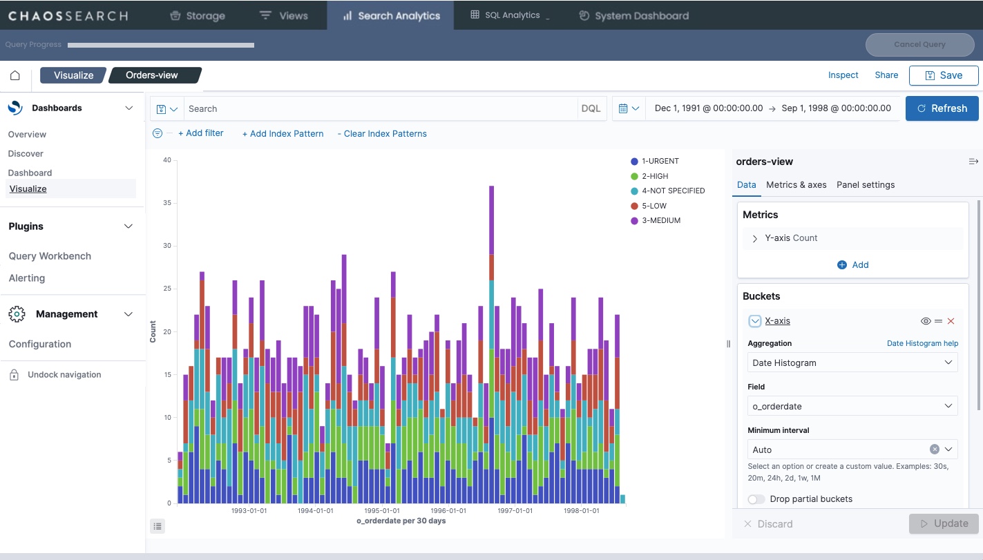
For example, the following visualization is a bar chart that shows a breakdown of the order priorities for orders completed on a monthly basis. You can see how the total count of orders is distributed across priority.
Saving a visualization of interest allows permitted users to open and use the visualization to see the same summary for a different time range. This can be helpful for detecting trends or changes in patterns, or changes in overall totals. You can export and import visualizations to save them for possible use in another environment, such as to bring favorite ones from development areas to production or to import custom ChaosSearch Customer Success projects.
Display a Visualization
To display a visualization:
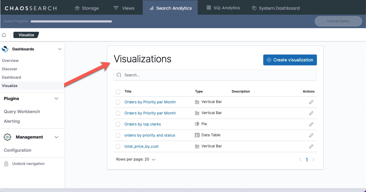
- In the ChaosSearch console, click Search Analytics > Visualize. The Visualizations page appears.
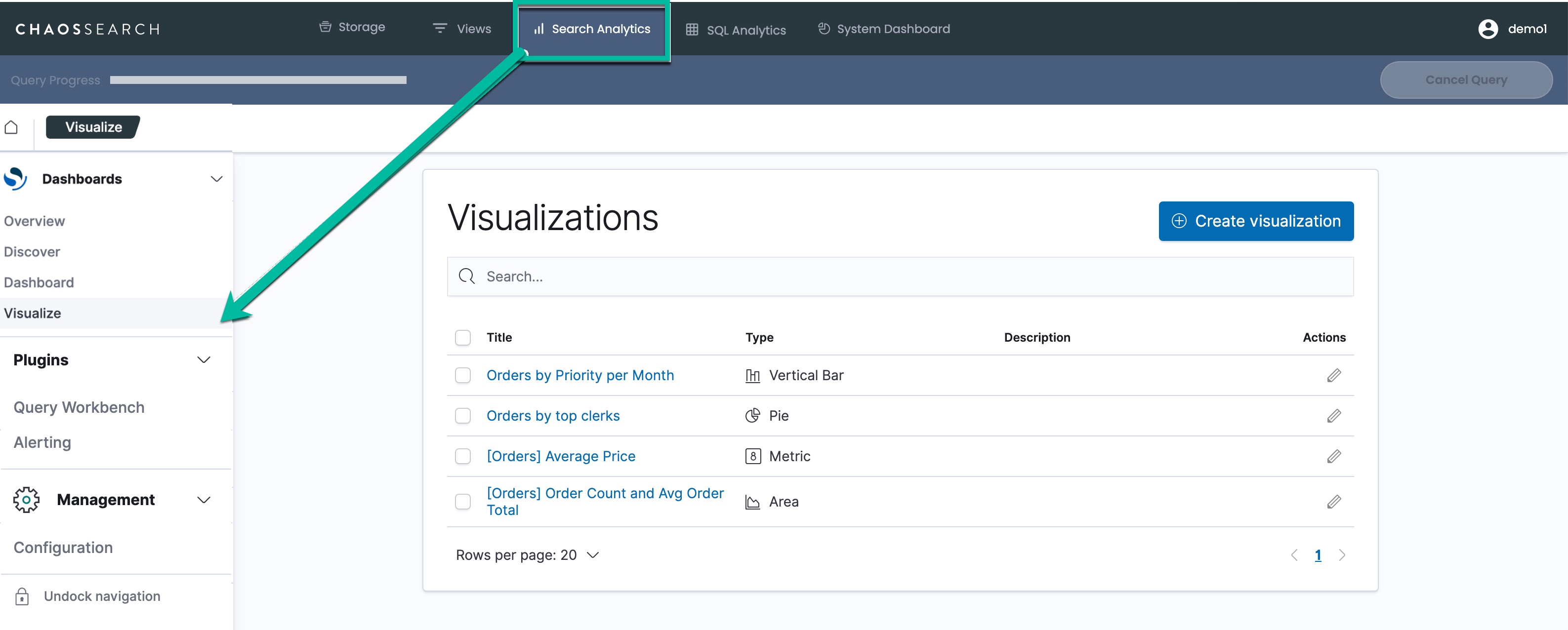
In the Visualizations list, click the title of a visualization to run it.
Visualizations FilterIf the list is very long, you can use the search field to reduce the list. Note that the search value is case-sensitive and must match from the beginning of the visualization name. Strings will not be matched in the middle of the visualization name.
A sample visualization follows.
"No results displayed because all values equal 0."In the case where a visualization is not displayed, check to make sure your time filter is properly configured. By default the time range is set to the last 15 minutes.
See setting time ranges for more information.
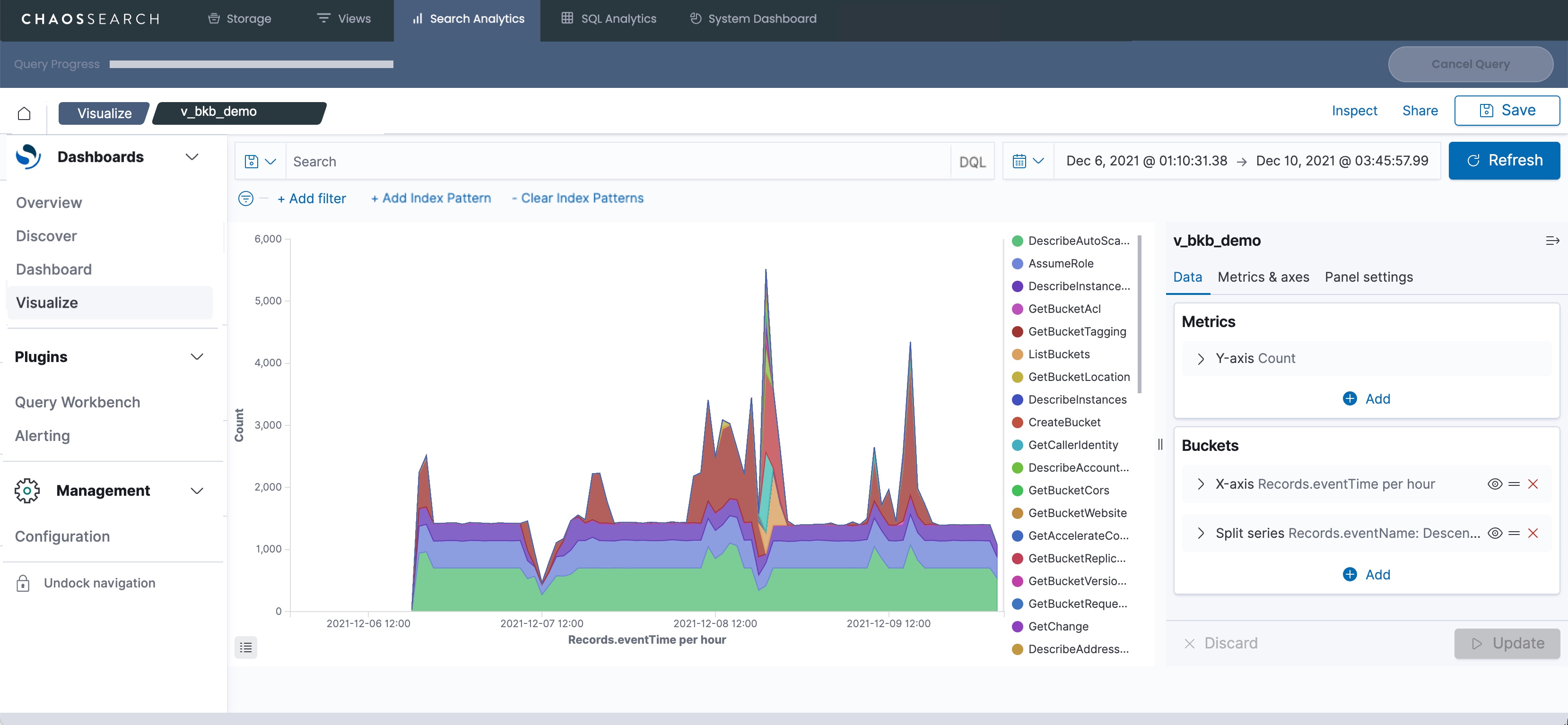
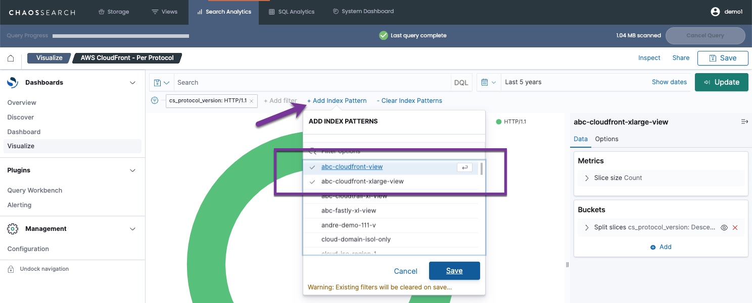
Within the visualization, you can click within the chart to take other actions like display more information about a data point, change the default time range, and drill down into a closer look at the data. You can also use the Add Index Pattern/Clear Index Patterns controls to select and to clear additional views to include in the visualization before you Update.
Aggregations—OpenSearch Dashboards' (and Elastic's) Version of GROUP BY
When using SQL queries to analyze data, the GROUP BY syntax is an important and powerful way to summarize data into categories. For example, analysts might want to see these types of summaries:
- Outages grouped by service to identify most problematic services
- Sales grouped by representative or by region over time to trend revenue forecasts
- Service tickets grouped by resolution time buckets to determine service level agreement adherence
In SQL, GROUP BY is the way to collapse data into the requested buckets to enable these types of summaries.
In OpenSearch Dashboards, aggregations are the way to collapse the data into requested buckets to enable visualization of these types of summaries.
In the Search Analytics > Visualizations page, you can create and use aggregations to specify how to combine records in the ChaosSearch index data to answer analysis questions for yourself or your users.
For example, the TPC-H orders table information contains details about orders for various items, associated with various clerks, with information about order keys, order priorities, ship priorities, costs, and so on. A sample TPC-H record follows:
_id:1173 o_clerk:Clerk#000000175 o_comment:side of the bold platelets detect slyly blithely ironic e o_custkey:88 o_orderdate:Aug 1, 1998 @ 20:00:00.000 o_orderkey:4,678 o_orderpriority:4-NOT SPECIFIED o_orderstatus:O o_shippriority:0 o_totalprice:131,752.07 _type:doc _index:orders-view _score:1One possible orders-related summary might be:
What is the distribution of order priorities for the orders in a specific time range?
You can create a visualization of that data by aggregating records from the indexed data by order priority.
JSON Flex Fields in Visualizations
For your JSON views, if you use the Treat as Nested JSON or Materialize with JSONPath transformations, those fields are included in your Search Analytics visualizations as selections for Metrics and Bucket Aggregations.
- Materialize with JSONPath fields are included just like the other number, string, or timeval fields in the view as members of the selection lists for the metrics and aggregations.
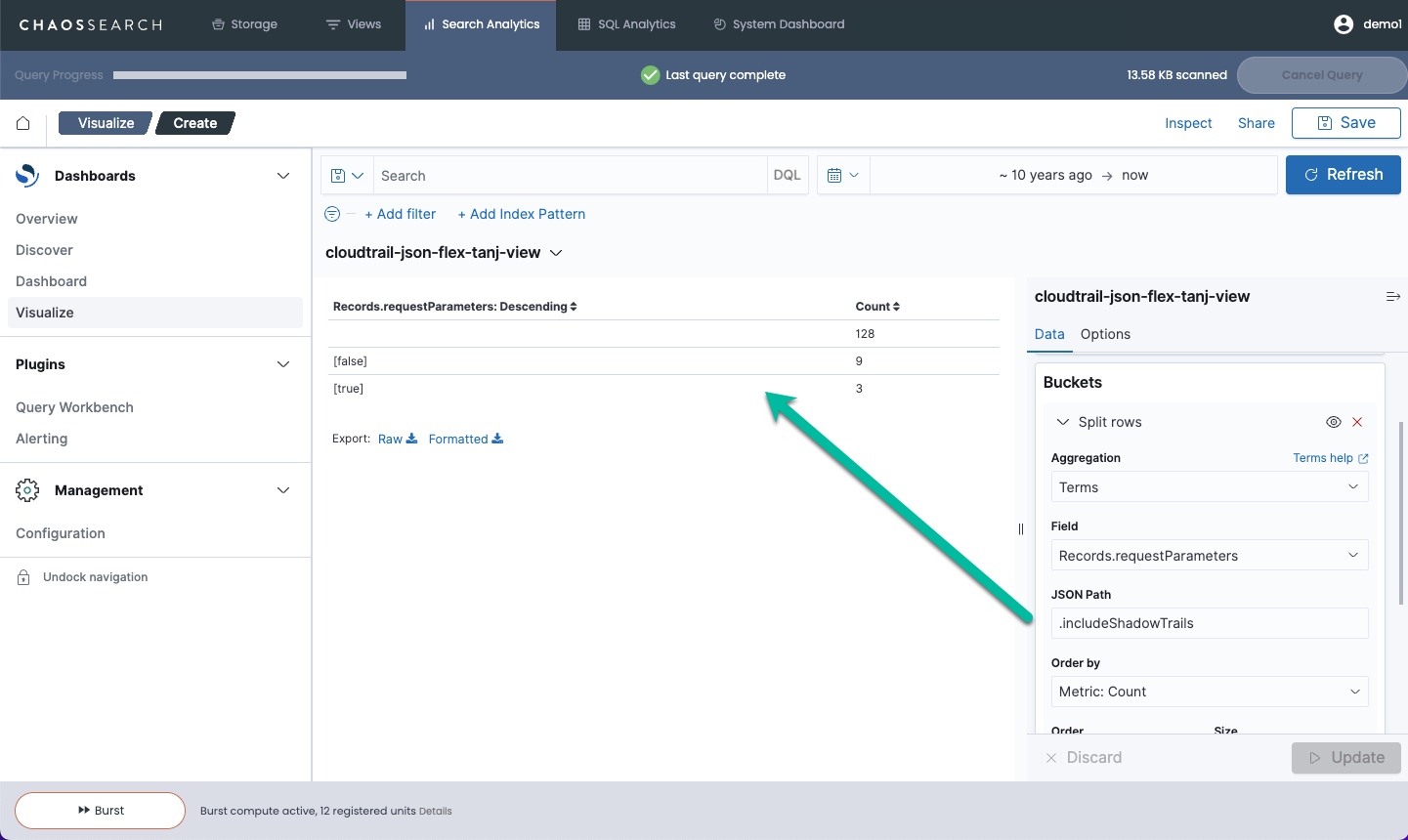
- Treat as Nested JSON fields are included as a special category of values for aggregations and metrics in charts. Where supported, you can select a nested field value and then use a JSON Path expression to extract the desired value from the JSON string value for use in the visualization:
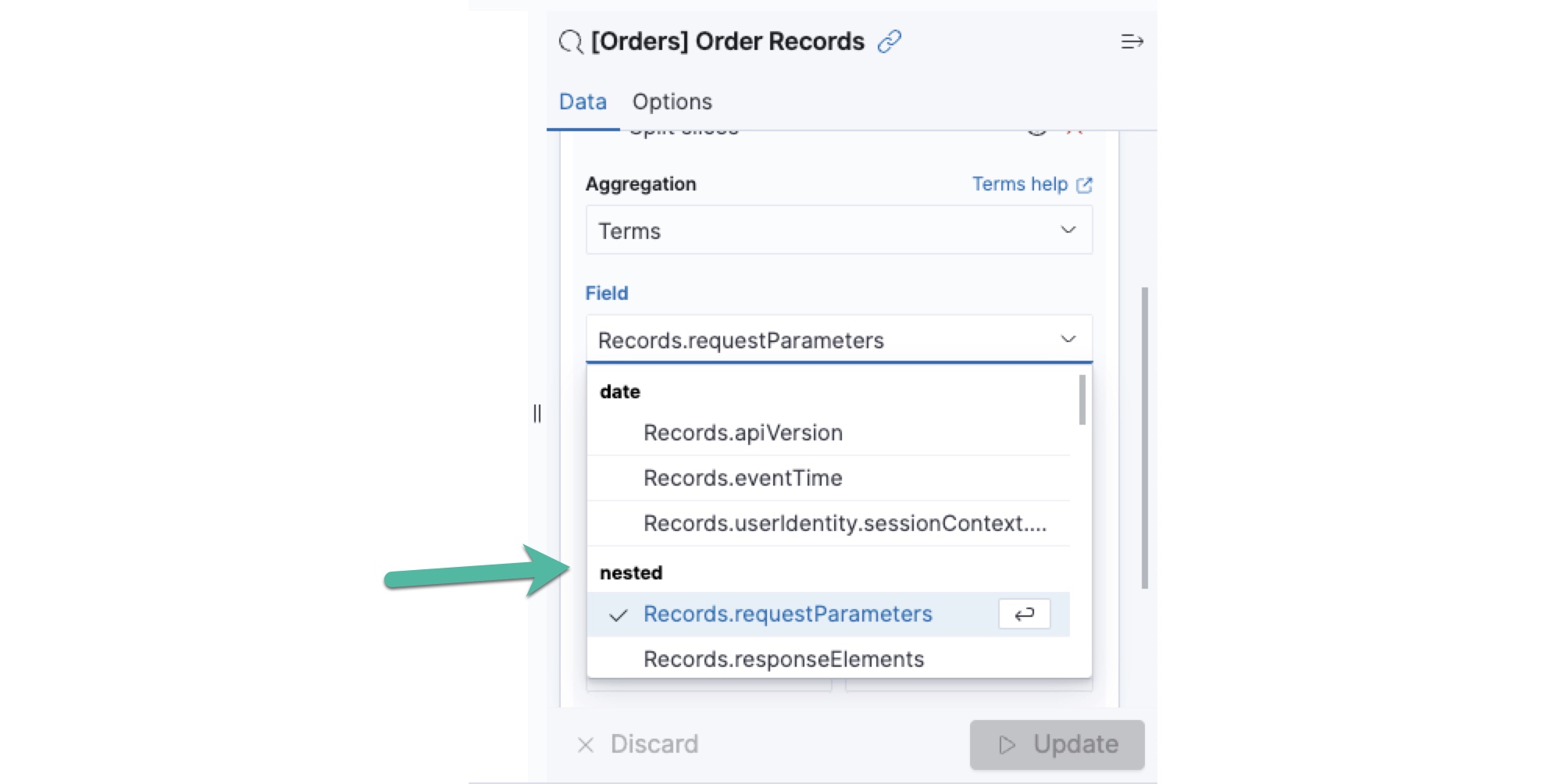
The following example uses the JSON Path value .includeShadowTrails to pull the value of the includeShadowTrails boolean field for the visualization:
Create a Visualization
To create a visualization:
- On the Analytics page, click Visualize.
In the Visualizations area, click Create visualization.
- In the New Visualization window, select a visualization type. This example uses a Data Table.
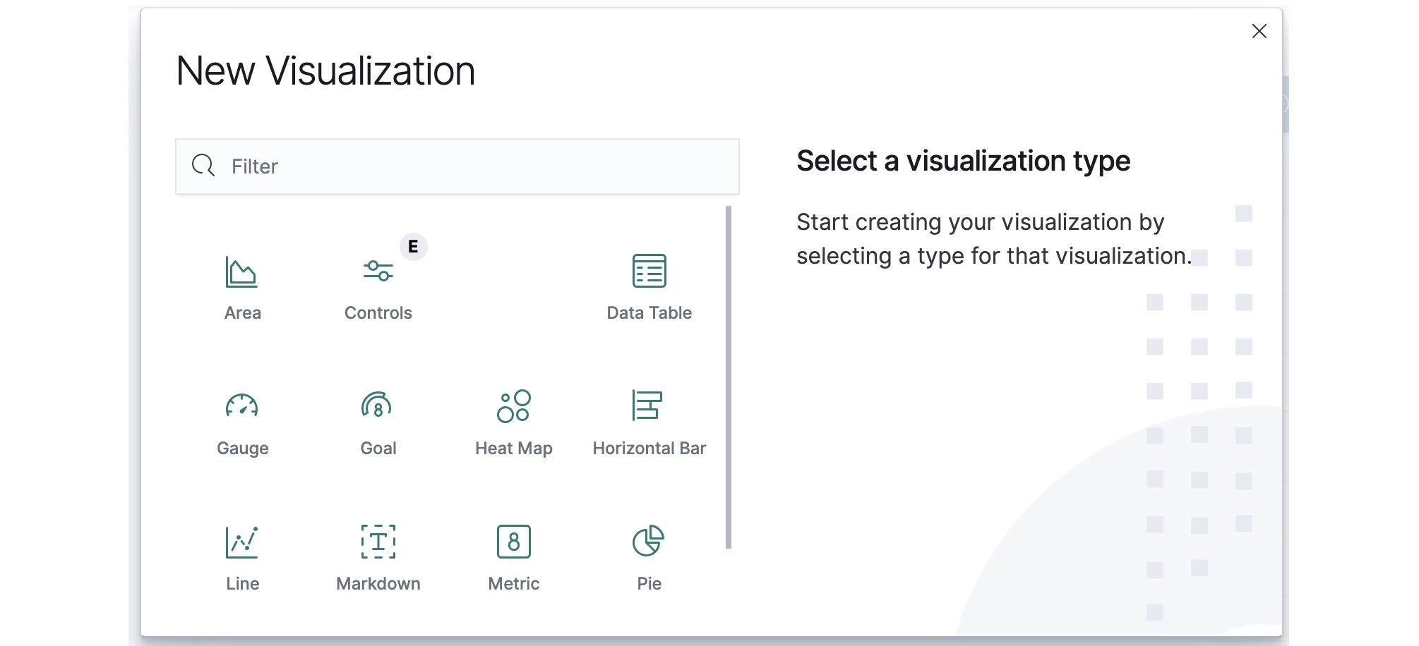
Chart TypesOpenSearch Dashboards offers many charts and graphs for visualizations. Hover over any of the types in the type chooser for more information.
- In the New Data Table / Choose a source page, select the Refinery view that you want to use as the source for your visualization. This example uses orders-view.

- In the Visualize/Create window, select a time range for your visualization.
- In the right menu under Metrics, use the default Metric Count because this summary will use a total count of the orders by priority. (There are other metric aggregation types like max, min, average, and sum.)
- Under Buckets, click Add and then click Split rows. (This aggregation will split the total count of orders by rows for each order priority.)
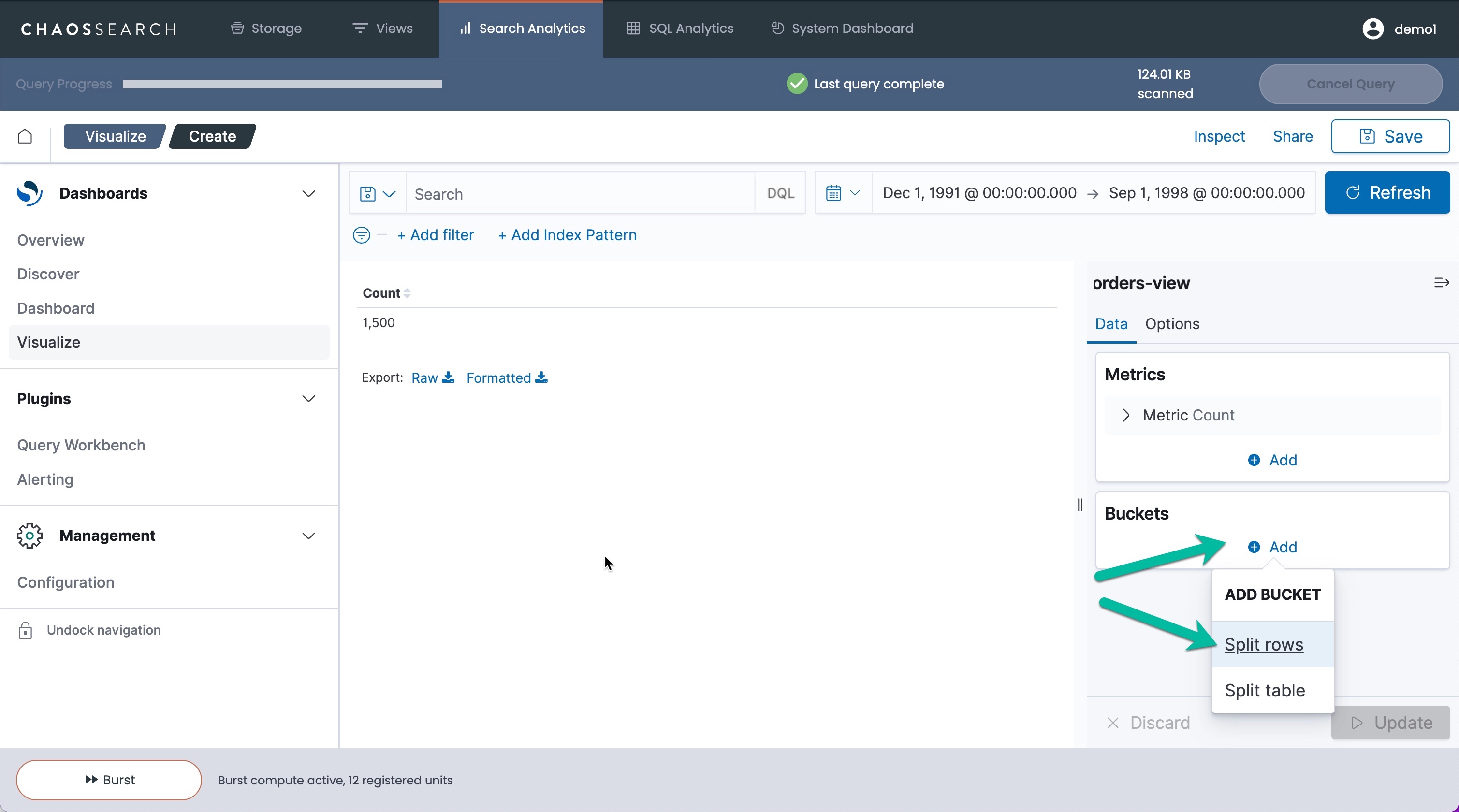
- In the Aggregation menu, select Terms to select a specific column/field value.
- In the Field list, select the column value (in this case, o_orderpriority).
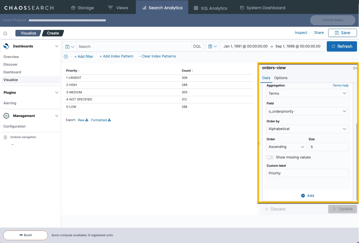
- Choose options for the data display. In this example, select Order by Alphabetical, Order Ascending, and type a Column label of Priority.
- Click Update to display the visualization.
The resulting data table shows the orders for the time range grouped by order priority. There is a count of the number of hits for each priority. If this is a visualization that you would want to review periodically, you can save the visualization. You can then re-open it and set time ranges as desired to see the data. You could also use the saved visualization in a dashboard.
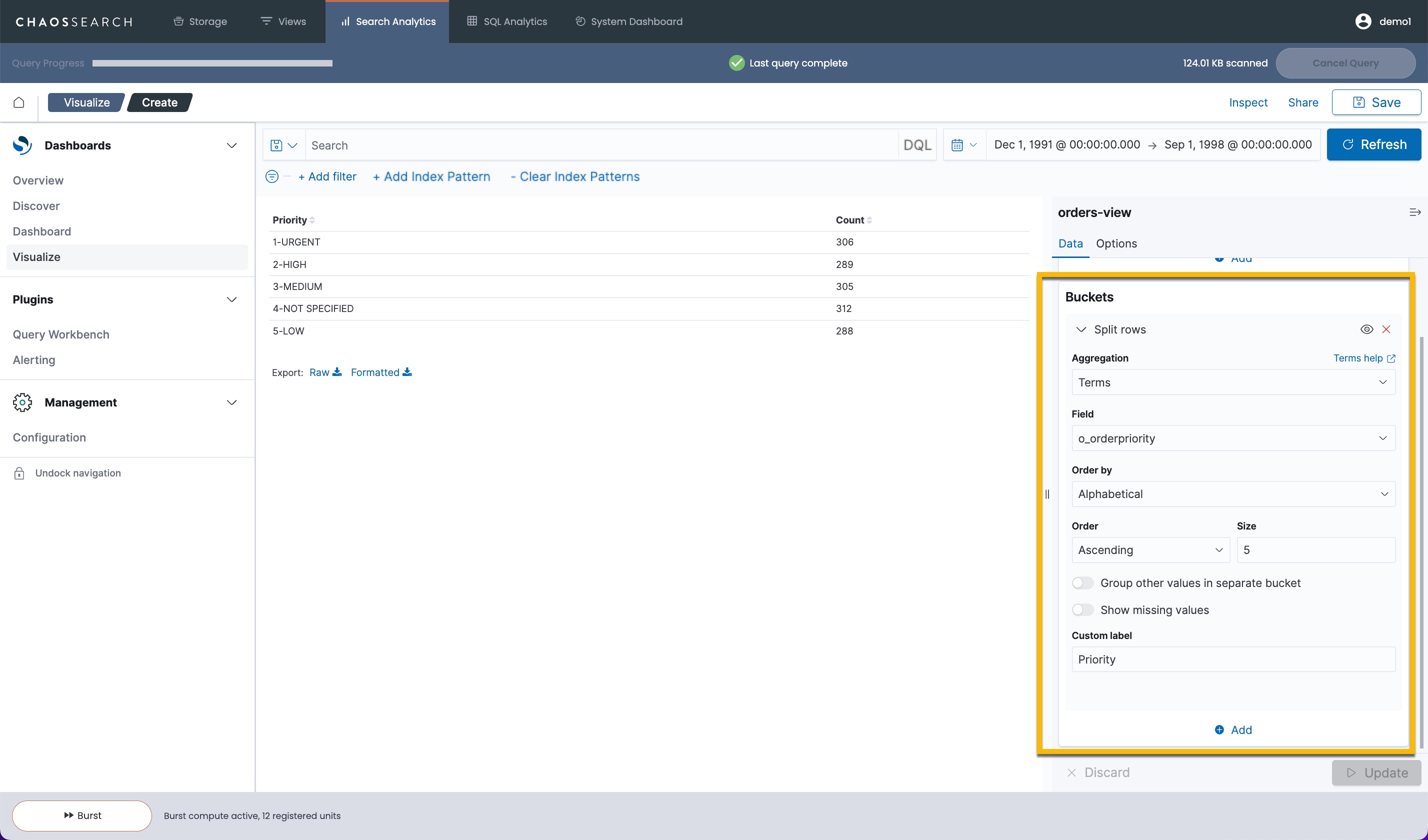
If you wanted an even more granular grouping—such as orders by priority broken down into order status value —you can easily add another bucket to split the rows by that additional summary. The split row process is identical.
- In the Buckets area, click Add at the bottom to add another grouping/aggregation bucket.
- For this case, add a Split rows bucket for the field o_orderstatus, similar to the following:
- Click Update to render the new visualization. The data table now shows each order priority broken down by the order status code (O,F,P) for the time range.
Always save your visualization if you or other users would want to review it periodically, or to use it in a dashboard.
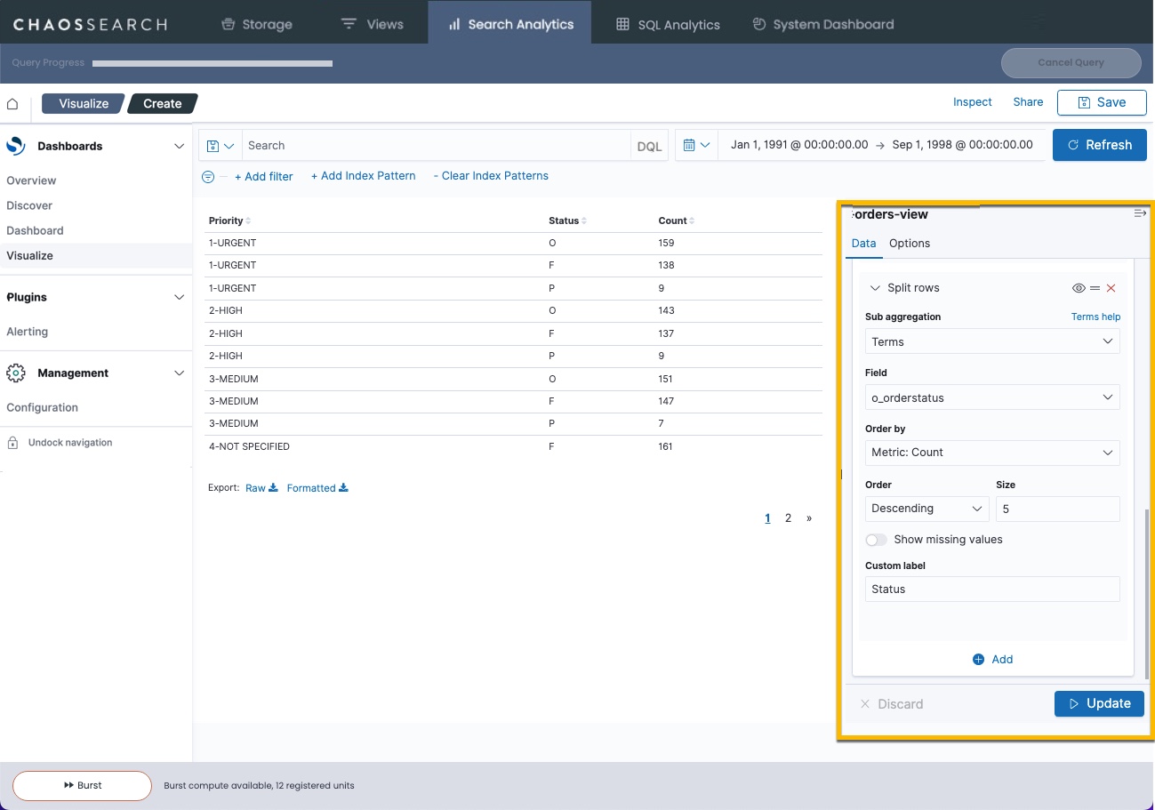
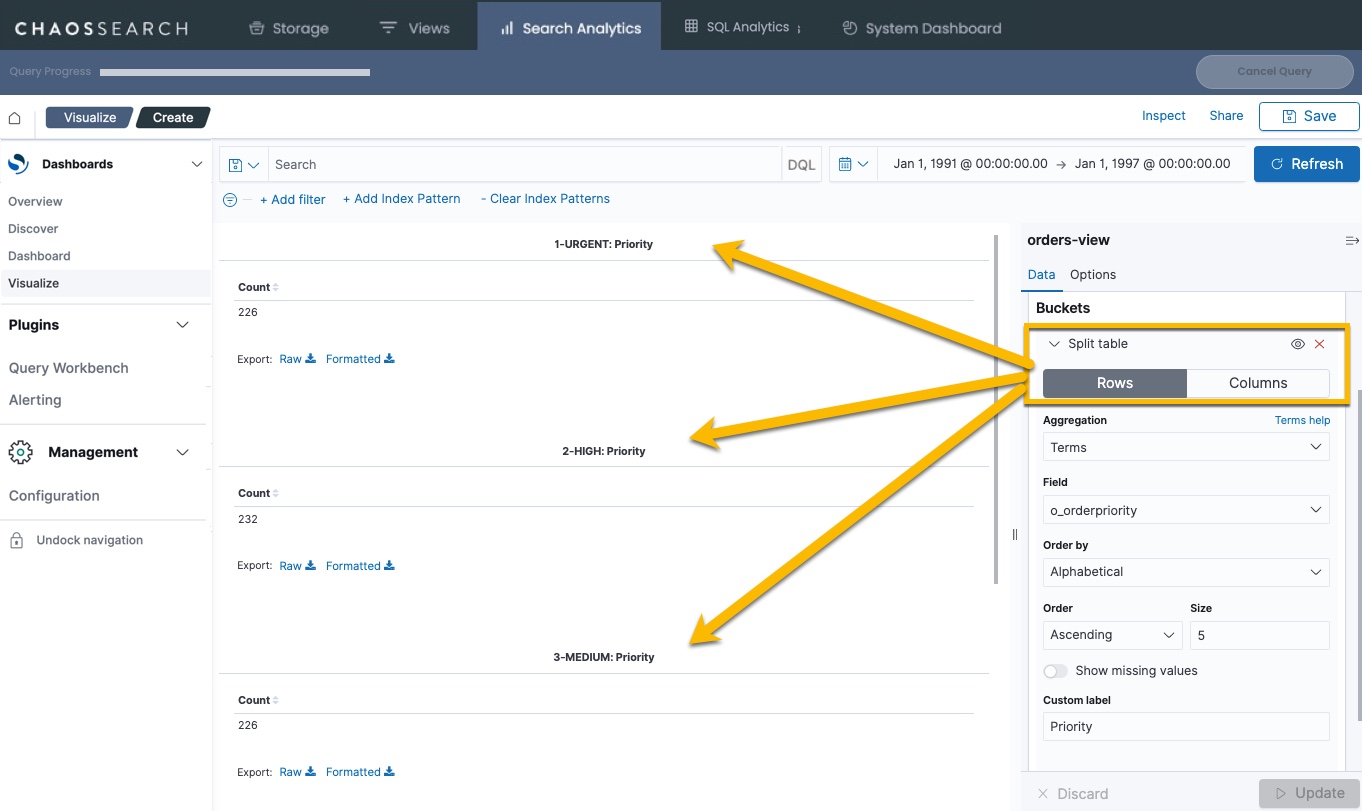
Split Rows Versus Split Visualization
Aggregations support the ability to split by rows (as in the table example above), and the ability to split the visualization into separate displays by summary using the Split <visualization> option. When you split by the visualization type, you create separate visualizations for each summary. For example, the Split table creates a table for each sub-bucket that you define, for example:
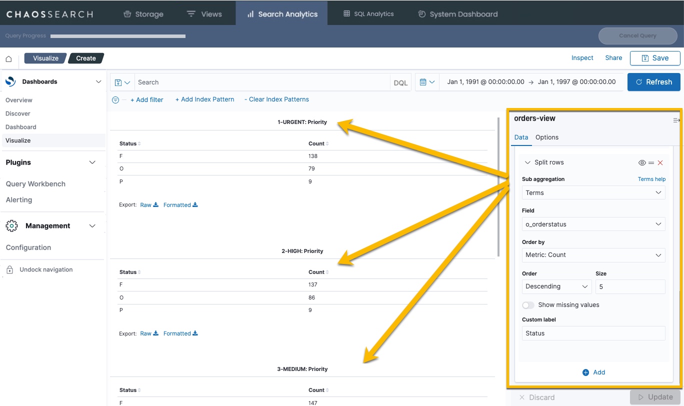
Likewise, if you add a Split rows definition to split priority rows by order status, you would see separate data for each status code in each priority table:
View Detailed Information
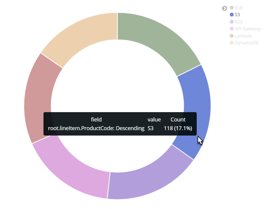
Hover over any of the visualization chart components (such as pie slices in a pie chart) to see detailed information including field value, term count, as well as overall percentage. In this example, the detailed information shows that there are 118 instances of S3, making up 17.1% of total occurrences.
Apply Filters to a Visualization
There are two ways to add filters to your visualization:
From the Legend or Chart
Click a part of the chart (such as a pie slice) or a legend for some charts to add that option to the filter. Click x to remove that filter if needed.
From the Add Filter Pop-up
Click Add filter to add filters to the visualization. Enter the field and operator criteria, and optionally a label, and click Save.

Filter Actions
When a filter is defined, it is displayed beneath the search bar.

Click on the filter for the following available options:
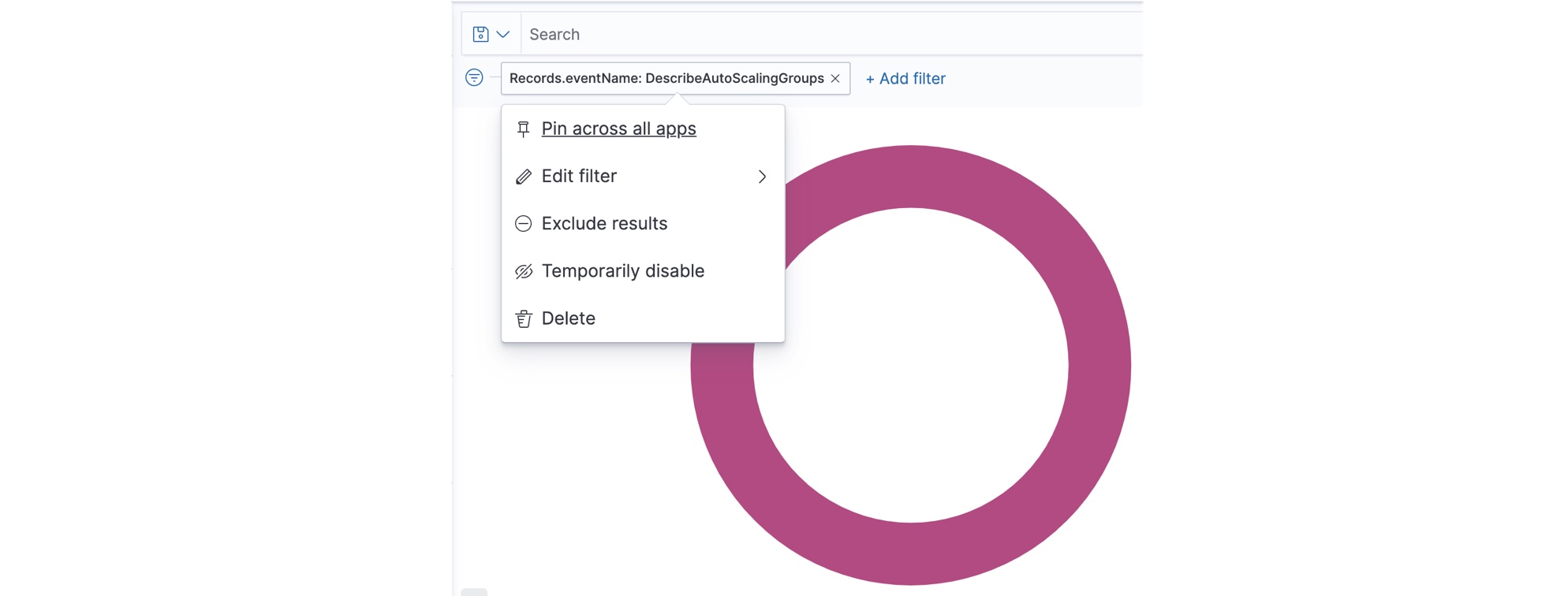
- Pin across all apps – Click to "pin" the filter. Pinning a filter keeps the filter across various screens (Visualize, Discover, and so on).
- Edit filter – Click to display the Edit Filter window and change the filter.
- Exclude results – Click to switch between a positive and negative filter. For example, if you are filtering for a certain field, this setting reverses the action to show all fields except for the filter.
- Temporarily disable – Click to toggle between enabled and disabled. A quick way to see the visualization without the filter but without deleting the filter.
- Delete – Click to remove the filter.
Updated about 1 year ago
What’s Next
Learn more about visualizations, or proceed to building a dashboard