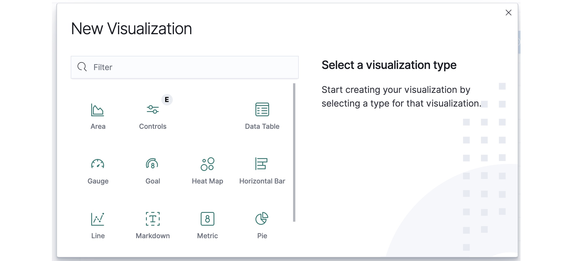
Choosing a Visualization Type
The New Visualization window offers a variety of chart types to choose from.
Each visualization type has benefits for how it shows the summary and breakdown of data. Good visualization choices can result in visually attractive charts that are easy to inspect to see the key data points and summary messages. Poor chart choices could result in a confusing display and make it difficult for end users to interpret (and possibly misinterpret) the summary and messages.
There is a lot of general information available from internet sites and other sources about the best practices for chart selections, design, and how to use visualizations to make information clearer and faster to interpret correctly. Testing with the available chart choices and using the left panel Options menus can help you to find the best chart types for the questions that you want the data to answer.
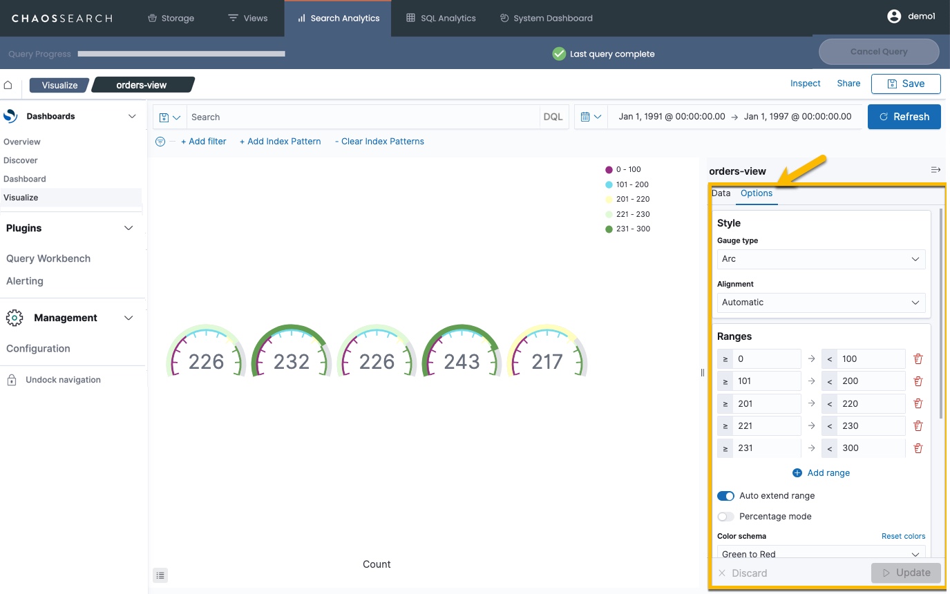
For example, the following gauge chart shows the TPC-H orders by priority data where order counts are color coded as "speedometer" dials to compare against configured ranges. You can control the colors, the ranges, and how the dials are ordered in the display, but you might find that this image requires more text or labeling to help someone to quickly see the relevant points.
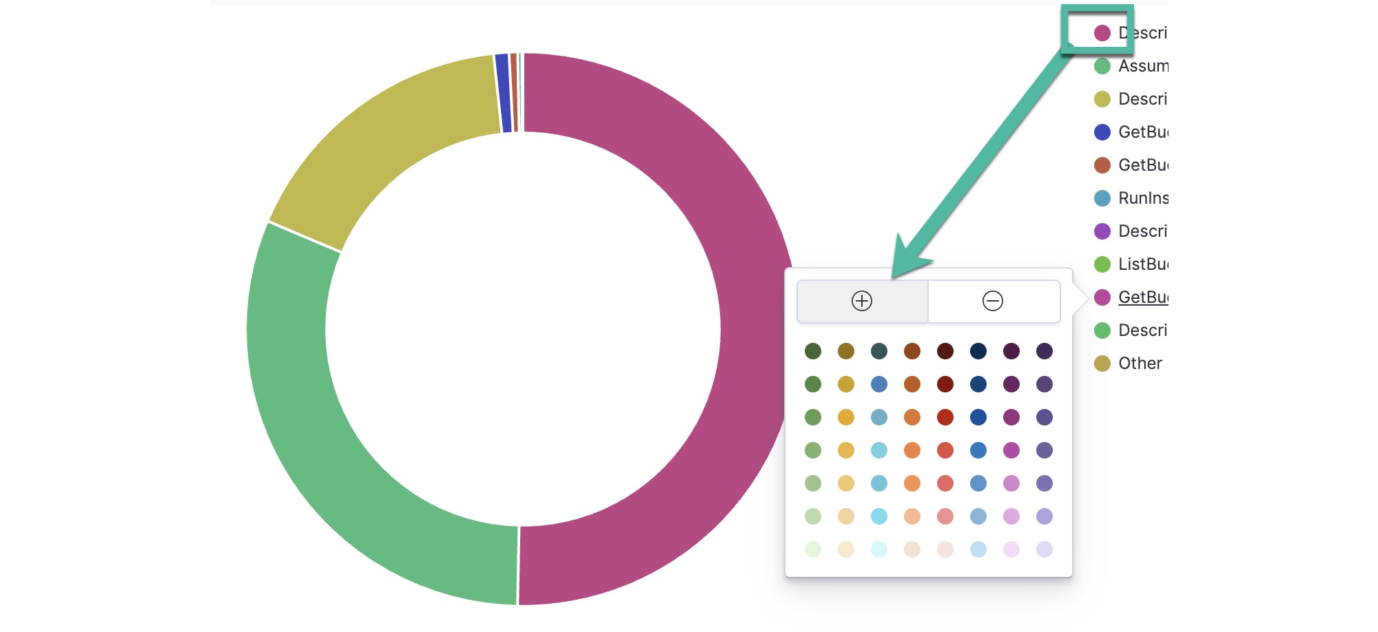
Change Chart Colors
You can customize the colors used in chart visualizations. For the sample pie chart, click a term shown in the legend and select any color from the color picker.
Updated about 1 year ago