Create a Chart
A chart is a way to visualize data that Superset queries from the dataset associated with the Refinery view. You can create charts from a number of different spots in the UI, but a common starting point is the + menu > Charts in the navigation bar, or the +Chart button on pages like the Charts page.
To create a chart:
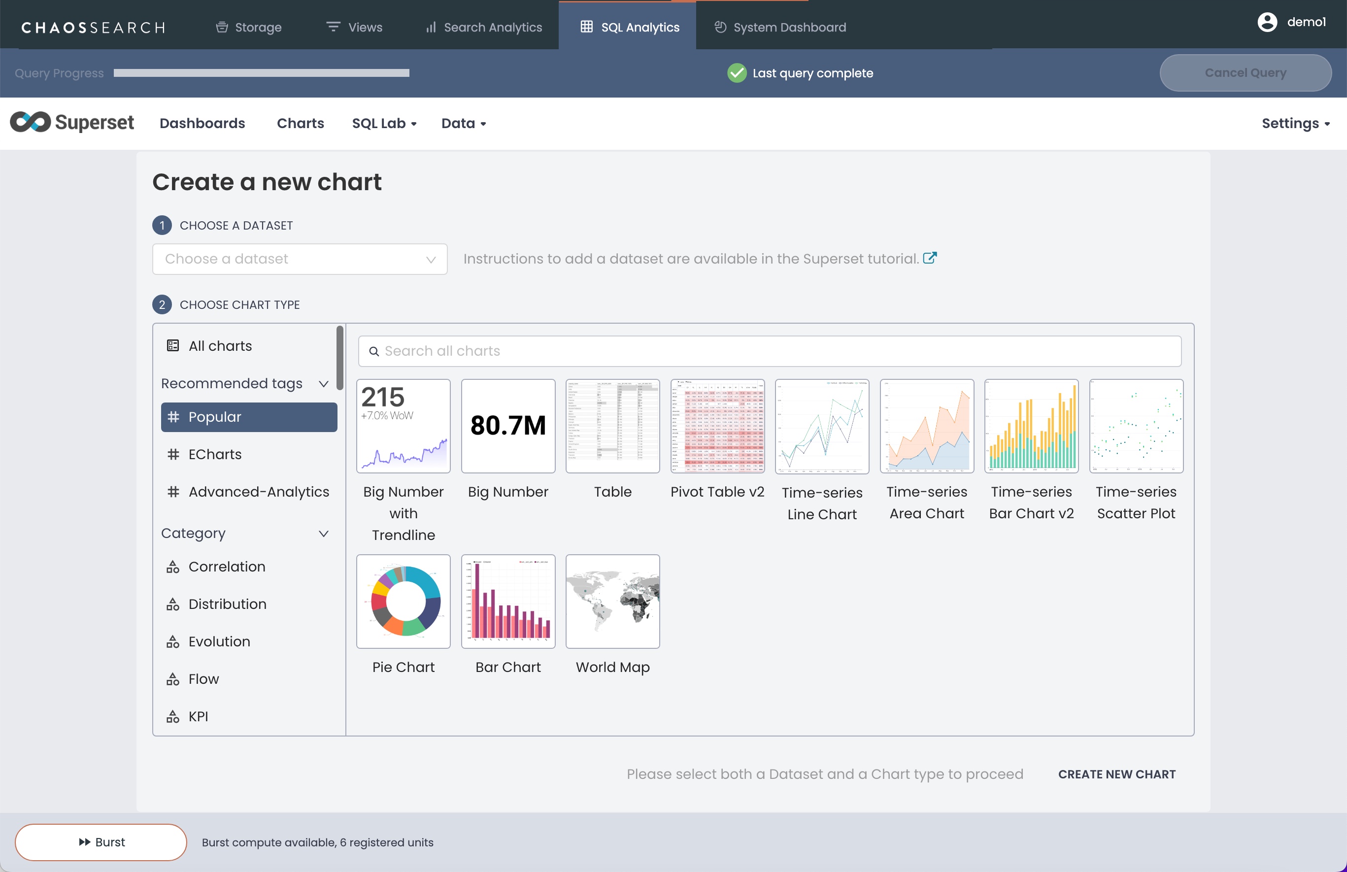
- Click + > Chart in the navigation bar. The Create a new chart window opens.

-
In the Choose a Dataset field, select a dataset from the drop-down list. Each dataset is a Refinery view that you have “added” to Superset. See Adding Datasets. If the list is empty, you have not yet added a dataset.
-
In the Choose Chart Type field, search for and select the type of chart that you want to create. There are options for many different kinds of visualizations.
-
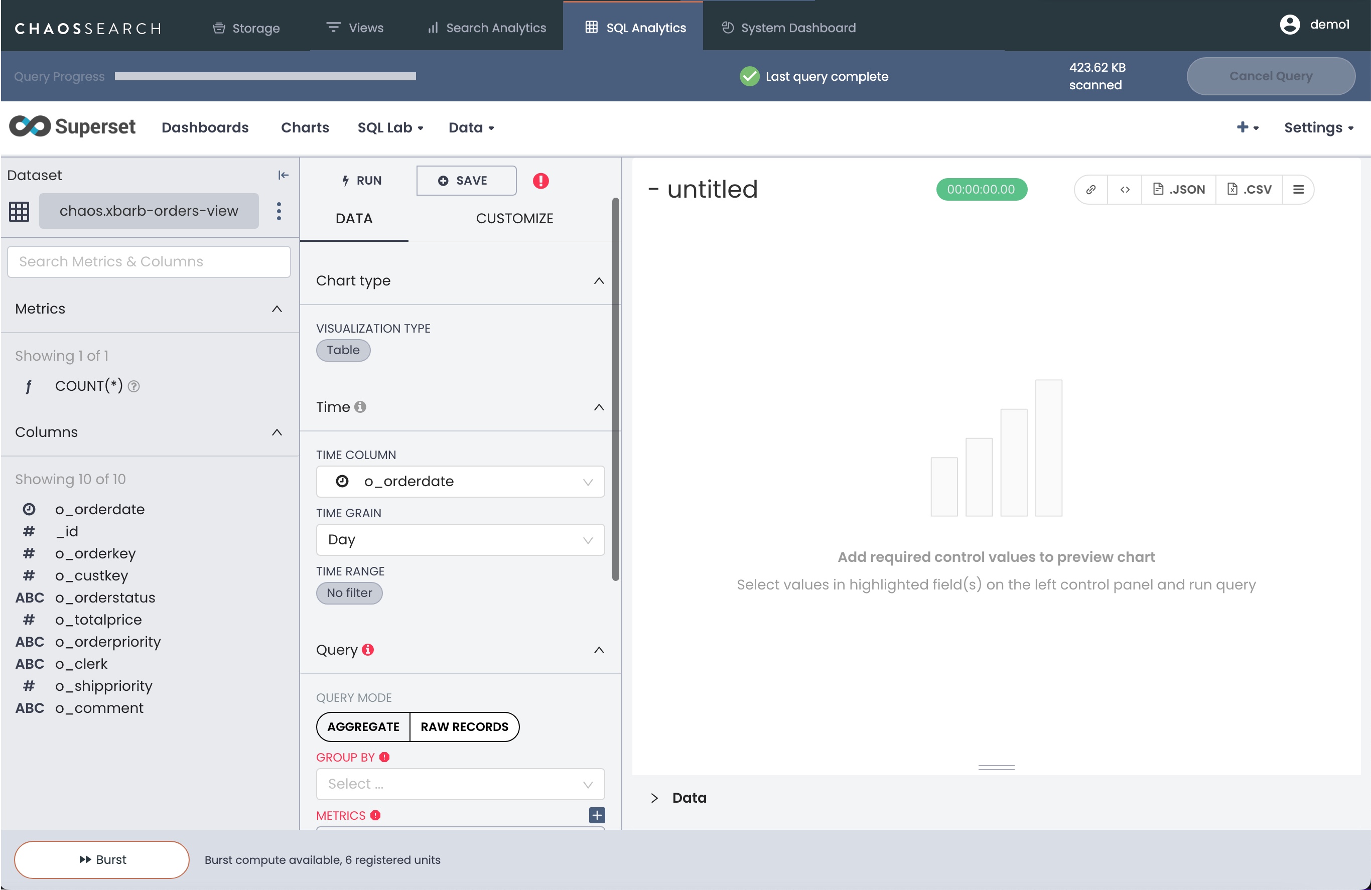
Click Create New Chart. The chart editor window appears. The controls and options for the chart will vary based on your chart type selection. The sample window is for a tabular chart type.

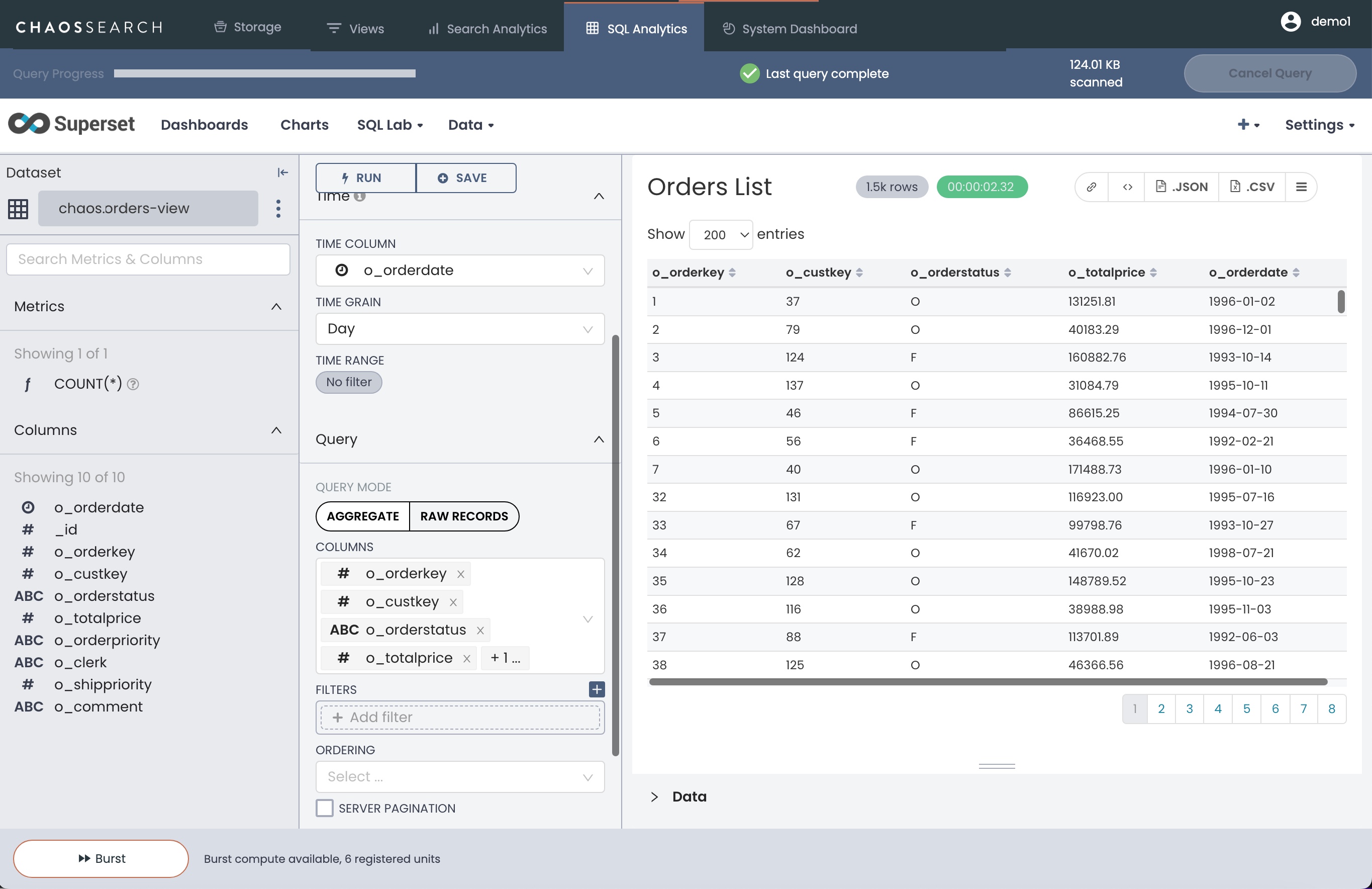
- Using the controls in the left menus, specify the contents to show in the table. A sample table with a custom chart title and several selected columns follows.

GROUP BY and Superset Calculated Columns
If you create a virtual calculated column, the calculated column cannot be used as part of a
GROUP BYoperation in a Superset chart at this time.
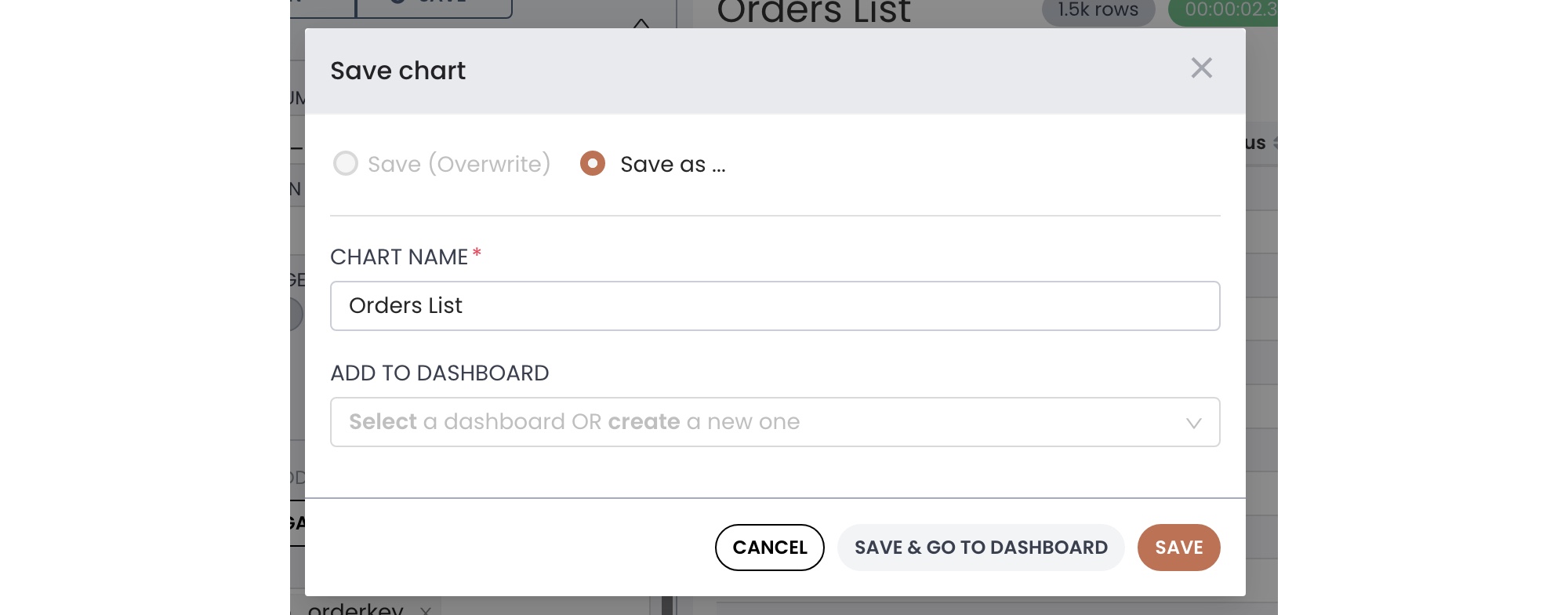
- When you finish creating the chart and its contents, click Save in the center right column. The Save chart window opens.

-
Specify or confirm the chart name, and if you want to add the chart to an existing dashboard, you can select the dashboard from the list.
-
Click Save to add the new chart to the Charts page. If you also added it to a dashboard, you could click Save & Go To Dashboard to display the updated dashboard with the new chart.
Updated 7 months ago
